I chose to produce a music promo package for an already established song. The song I chose was "Beyonce - Run The World (Girls)" belonging to a hybrid genre of Pop/R&B/Electro House. I recreated the artist's, already distributed video, with my own creative version. After undergoing several planning and researching stages, I finished my final version of the video and uploaded it to YouTube. I then chose to create a six panel digipak for my fictional artist and a magazine advertisement to then help promote the products. Below I will evaluate my media texts on the effectiveness of use of conventions, how the products work cohesively and the use of digital media during all stages of production, I will contrast this with audience feedback.
My fictional artist’s costume includes an iconic, long, black hooded cape in the beginning scene which took place in the setting of a hill. She walks from behind the camera into view through a long shot and lowers her hood revealing her face to the audience. A dramatic unveiling or revealing of an artist is particularly conventional in high production performance music videos. It creates an intense moment in the video were the audience are anticipating seeing the artist, in this case the fictional artist. The use of the cape connotes the idea of strength and superiority with their relation to superheroes/ villains.
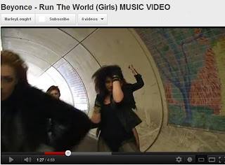 One of the most important convention within my chosen genre is dance sequences. I focused on this aspect throughout my video incorporating a large amount of choreography. The dances where upbeat with a fast tempo, matching the chosen song. These sections include a group of six dancers and the lead keeping the dance in unison to project the idea of a team and connoting the strength of females. I took the idea of showing a female figure from the Madonna - "Die Another Day" music video i analysed. The gestures also represent the idea of a battle cry from before the 1st World War where opposing teams would dance using violent gestures to intimidate the opposition. The ‘all blacks’ New Zealand rugby team still use this technique to this day before playing a match. The dances show a mixture of strong and violent gestures and sexy movements to create a contrast between power and the femininity of the women with their inner strength that the song is all about.
 In the dance sequences I kept the lead prominent at the front and central in the composition of the mise-en-scene. This keeps the audiences focused on the lead and aware of whom she is. As my lead is fictional I had to stress this even more as a real artist of this genre would be highly established and her placing in the frame wouldn't be, as important as the audience would be able to identify them immediately. I also incorporated moments where the dancers would be still in the scene and the lead would break out of the group walking forward and leading the action. This reinforces her role to the audience, showing that she is the leader and that the girls are following her every move.
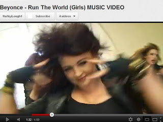 When filming the dance sequences I focused on the lead mainly but also on the other dancers, filming them as a group and individually. I used tracking shots and created hand held erratic movement to capture a violent feel and to compliment the detached beats within the music. Mainstream Dance R&B and Electro House music videos all incorporated this cinematic style and so I followed these conventions when filming my video. I used a mixture of long shots to show the girls as a group and hand held close-ups to show the individual dancers. The use of close-up and extreme close-up connotes the idea of confrontation between the audience and the dancers. This makes the audience feel close to the action and almost as if they are the males which the females are squaring up to.
 I also reinforce this idea with the use of a P.O.V tracking shot when the males are running behind the lead to try and attack her, in the setting of the tunnel. This use of cinematography places the audience in the action, again making them feel like the males and intimidated by the females. I chose to use a tunnel for this location to create symmetry within the mise-en-scene composition and the framing; it also adds a sense of depth to the shot.
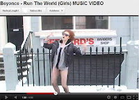
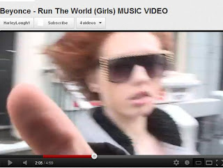 In the section of the diegesis which takes place in the setting of a Barber shop, the lead breaks the fourth wall by pushing the camera out of her face at medium close-up proximity. This directly acknowledges the fact she is being filmed, breaking mainstream conventions. This is a postmodern characteristic of current music videos as this technique is a self-reflexive feature. This use of a fast pan adds a sense of violence to the shot almost as if she is saying ‘get out of my face’. This connotes the idea of the audience being the males and that she is shoving them out of the way.
Another way I kept my lead prominent in the scenes was through mise-en-scene and costuming, to connote her importance and high status in the video. The dancers wore a toned down version of what the lead wore. The main outfit included an assortment of ripped leggings, a leather jacket, black leotard and military boots. The ripped leggings makes the girls appear dominant, as if they have being fighting and they have war wounds. The use of a leather jacket is iconic of the 50’s biker look and gives a rough connotation, resembling the ideology of the bikers and their ‘rough and ready’ attitude towards life. The use of military boots reinforces the idea of war and the military. The fictional artist wore a leather jacket coated with fur (adding connotations of wealth and upper class), and green doc martins iconic of the 80’s skin heads who were notorious for their violent way of life. Her lipstick was bold ‘danger’ red and her hair down and naturally curly. These slight changes helped to project the lead as well as her being the one miming to the song. The artist should stay the focus of the scene conventionally and central in composition, so I chose to follow this in my video.The use of black and red in the costume and make-up also continues the colour scheme throughout the mise-en-scene.
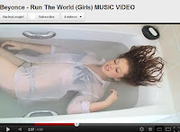
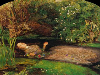 I also incorporated a total of eight costume changes for the lead and two for the dancers. Through analysing music videos of similar genres I noticed frequent changes of costumes. I also included a range of costuming from simple to complex, such as the bath scene, where the lead is dressed in only her underwear with a white shirt and minimal make-up. This is to include an element of natural beauty within my video which puts across a good moral message to the young age group which dominates my target audience. The use of costume intends on connoting purity and innocence. The scene takes place in the setting of a filled bath where we can see the lead laid down through the use of a high angle/bird’s eye view medium long shot, resembling the pre-Raphaelite painting of ‘Death Of Ophelia’. The painting holds connotations of youth, innocence and virginity which I wanted to put across in this section of my video. The lyrics for this scene are, “Boy I’m just playing, come here baby, hope you still like me, if you hate me.” She is talking directly to the men pretending that she isn’t really nasty and is just a sweet, innocent girl underneath her violent exterior. The use of blood later on in the scene, which fills the bath, connotes the idea of loss of virginity. This contradicts her sense of innocence subtly signifying to the audience that she is lying to the men. The blood also symbolises the lives the females have taken in order to rule the world through battles and wars.
 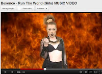 The mise-en-scene of these two scenes within my diegesis are juxtaposed where there are clear connotations of heaven and hell. The use of the fire background imitates people’s idea of what hell is like and also creates a dangerous environment for the artist. The inclusion of water within the diegesis of my video in conjunction with the white costuming helps connote the idea of angels and heaven, as these colours are associated with this aspect. the use of water also symbolises the act of baptism and holy water. This creates a contrast in the lead’s personality showing her true identity of being in control and violent and covering it up with a false sense of purity and innocence. This all relates to the lyric meaning of “boy I’m just playing...” showing how females can be very vindictive and sneaky but cover it up and get away with murder through their sexiness and effect on men. Women can control and manipulate men using their femininity and sex appeal. For this section she is dressed in heavy black clothing, such as leather-look leggings, heels and a black netted dress with black makeup and a bullet chain neck piece. The use of black contrasts against the use of white costuming in the bath and bedroom scene to show her evil dark side. The use of black connotes the idea of Gothic clothing all associated with death and worshipping of the devil. This is an example of more complex costuming which also contrasts the simplistic use of costume in the bath scene.
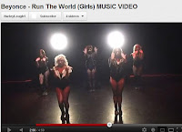.jpg) There is also a dance section which is performed in the theatre and is back lit with two spotlights supported by a tripod with a light red wash over the dancers. The lighting intends on creating a hot atmosphere to link with the lyrics, “its hot up in here…” The scene also resembles the idea of hell with the feeling of intense heat and the use of black in the setting. The lead doesn't appear in this section which is unconventional but I cut in shots of her from the bedroom section which slowly builds up the audience's anticipation as to what is coming next. I chose not to include the lead in the dance section as the lyrics are talking about 'her girls' for example "I'm repping for the girls..." and "this goes out to all the women..." This again shows the girls as a team and almost connotes the idea of a female army for the fictional artist 'B'. It could also be interpreted as the girls waiting for her in hell.
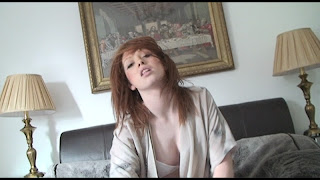
There is also a dance section which is performed in the theatre and is back lit with two spotlights supported by a tripod with a light red wash over the dancers. The lighting intends on creating a hot atmosphere to link with the lyrics, “its hot up in here…” The scene also resembles the idea of hell with the feeling of intense heat and the use of black in the setting. The lead doesn't appear in this section which is unconventional but I cut in shots of her from the bedroom section which slowly builds up the audience's anticipation as to what is coming next. I chose not to include the lead in the dance section as the lyrics are talking about 'her girls' for example "I'm repping for the girls..." and "this goes out to all the women..." This again shows the girls as a team and almost connotes the idea of a female army for the fictional artist 'B'. It could also be interpreted as the girls waiting for her in hell. 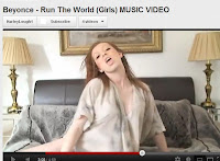 The setting of the bedroom section displays the use of fur covers which connote royalty and wealth, linking with the costuming from the opening sections where the lead is wearing a fur/leather jacket. There are two mirrored bed side tables either side of the bed which symbolise vanity and voyeurism and also two over sized lamps which help add symmetry to the composition of the mise-en-scene and represent a gateway/opening. The tapestry of the last supper is central to this opening and connotes the idea of heaven, as though the gateway is leading the artist to heaven and God. This shot is inter cut with the dance section in the theatre two show the opposites of heaven and hell which all adds to the sense of opposition in her personality and between the two conflicting genders, that the song is all about. The colour scheme of black, white and red all add to his with the contrasting tones of black and white which are appropriately used in these contrasting settings. The use of cutting between different locations when moving or miming (match on action) with a change of background is also conventional of mainstream music videos. The cuts link the scenes and settings together and relate sections or help contrast sections as I have done here.
 In the final section of my video the lead and dancers are dressed in a selection of camouflage army uniforms. I also incorporated face paint to create a more realistic effect. The influence for this came from Beyonce- "If I Were A Boy" where Beyonce takes the role of her male lover and is dressed in a police uniform. The use of army costuming creates a dominant representation for the females showing they mean business. The fact that they are in a group makes them appear like an army of female soldiers and the dance sequence they perform connotes the idea of drill, with the use of saluting gestures.
Due to the upbeat tempo and genre of my chosen song fast paced editing would be conventional to abide by when editing the video together. I chose to follow this convention keeping the shot lengths on average 1.5 seconds to keep the video continuously moving and to allow a lot of content to be shown in a short space of time. With a cast of 8 these short shots helped show each dancer but keeping the focus on the lead. I also include a repeating strobe effect which layers two pieces of video over the top of each other and fastly cuts between the two. This is typically conventional of electro house music videos to connote the idea of a club scene. As my chosen song features sections of 'pon de floor' an electro house song I thought this effect would work well and include elements of the hybrid genre the song is a part of. Another feature of the electro house genre and also dance videos is reversing sections of movement. In the opening sequence of my video I shot short dance movements forward then immediately backwards in time with the 'pon de floor' samples of music directly linking the effect with the genre. The section of the song sounds as though it is being played and then reversed, so I thought this technique would work well with this piece of track. My video doesn't only include pop/R&B conventions but also incorporates features of the mixture of all genres my song choice belongs to.
There is a break-down/bridge section in the music where there is no repetitive beat and the lyric begins "My persuasion can build a nation..." These scenes were filmed on a well-lit green screen which I then added a fire back ground in post-production on the editing suite. As this section of music is slower than the rest of the song I decided to slow the shot lengths down to 4 seconds and use cross dissolves to cut between each shot. This provides an obvious contrast and allows the audience to watch the artists easily without fast cuts. It also reveals the underneath layer of video slowly which adds depth to the section. The use of fire connotes danger and destruction which links in with the meaning and lyrics, "who run the world?" This is because endless wars and battles have to be won before someone becomes a leader of the world and the roaring orange fire reflects this idea.
I included a wide range of locations, a total of twelve. This is because music videos conventionally use multiple locations as I learnt after the previous research I undertook. I use a mixture of rural and urban landscapes with shots of industrial areas and also private areas such as the bathroom. I wanted to try and cover as many different locations as possible to show a selection of areas within the world to link in with the idea of my chosen song. Simply placing the girls in that space with no males in shot connotes the idea of the girls being in charge and running that 'patch' of land.
I chose to include scenes of voyeurism and narcissism which are particularly conventional of female mainstream pop/R&B music videos. The idea that the artist is touching her body in a sexual manner and is unaware of the audience watching her is narcissistic and voyeuristic representing self-love and self-worship. I also use hidden satanic symbols in this scene as when I was researching I came across this propaganda. The skull and horns in the background of the scene, on the chaise longe, is a symbol of the devil which continues the connotations of red and black in this scene. I chose to include the skull in this particular scene as looking at another person sexual is
.jpg)
.jpg) I continue a clear colour scheme throughout my video which includes red, white and black. This can be scene within the mise-en-scene of the barber section with the shop sign in the background in these colours. Also throughout the costuming with the black costume from the fire section and the main outfit; the red flames of the fire; the white shirt and contrasting black underwear from the bath scene; the black cape from the opening; the use of red lipstick throughout; the white bathroom itself and many more. This creates continuity throughout the video and links the sections together thought the repeated use of colour. These colours are also strong and symbolic with white connoting purity and good, black associated with evil and gothic activities and red which is related to the devil and holds connotations of warning and danger. The colours are appropriately linked with what is going on in the scene conventional of music videos which also use colour schemes to create identity and link scenes together. For example in the fire section the use of black Gothic costuming represents her evil dark side as she mimes, "My persuasion...endless power." The red flames produce a dangerous environment linking the themes of this scene together. This strongly contrasts with the bath section with the use of water, which is the opposite to fire, the white simple shirt which adds a sense of purity and good to the shot. These two scenes are juxtaposed to create extremity and show the good and bad side to the performer. The fire and water are both elements of the earth again linking in with the idea of running the world.
I continue a clear colour scheme throughout my video which includes red, white and black. This can be scene within the mise-en-scene of the barber section with the shop sign in the background in these colours. Also throughout the costuming with the black costume from the fire section and the main outfit; the red flames of the fire; the white shirt and contrasting black underwear from the bath scene; the black cape from the opening; the use of red lipstick throughout; the white bathroom itself and many more. This creates continuity throughout the video and links the sections together thought the repeated use of colour. These colours are also strong and symbolic with white connoting purity and good, black associated with evil and gothic activities and red which is related to the devil and holds connotations of warning and danger. The colours are appropriately linked with what is going on in the scene conventional of music videos which also use colour schemes to create identity and link scenes together. For example in the fire section the use of black Gothic costuming represents her evil dark side as she mimes, "My persuasion...endless power." The red flames produce a dangerous environment linking the themes of this scene together. This strongly contrasts with the bath section with the use of water, which is the opposite to fire, the white simple shirt which adds a sense of purity and good to the shot. These two scenes are juxtaposed to create extremity and show the good and bad side to the performer. The fire and water are both elements of the earth again linking in with the idea of running the world. When producing my ancillary texts I used screen shots from my finished music video to keep the images directly related to my video as the album was to promote this particular track. The front cover image keeps the fictional artist dominant with the dancers behind and the lead central. This particular image provided enough spacing for texts and a parental advisory warning, (due to the provocative scenes within the video). I placed the text behind the lead to make her stand out and emphasise her role. The size of the font for the artist's fictional name 'B' was bigger than the title of the album keeping with the conventional album front cover. I wanted to continue the colour scheme throughout my ancillaries to link the products together to make them easily identifiable to the audience and consumers so I used black for the text. The sky in the image appears almost white and the costumes also black from the Video all keeping within the colour scheme. Even the parental advisory sticker was black and white.
For the back cover I used a screen shot that provided enough spacing either side of the main image for the tracks to be placed conventionally. Again I continued the same font through to this cover and kept the colour of the writing black. The wall in the background of this photograph is red brick which I emphasised using the selective colour tool on Photoshop continuing the colour scheme to create continuity. I used an image of just the artist this time to focus the attention on just her alone and keep her centre of the tracks to show she is the one who produced all the tracks that it is her music and she is the centre of her fictional music. I included all the legal information in small print on the bottom third of the page with the bar code in its conventional placing with website information and the fictional record label which I created. Again I kept this text black within the colour scheme and to keep the text subtle and not stand out against the background.
The inside panels, where the CD and DVD can be found, I used a fire theme to link all three covers together. I used a sourced image of fire for the background to create a slight contrast in colour against the CD and DVD keeping with the conventions. Again I used screen shots from the video to keep the covers linked directly with the main product. I chose medium close for the DVD with the artist's eyes looking directly at the audience. Her hands where perfectly positioned for me to place the DVD symbol on one of them. This particular image connotes the artist's influence over the men in this section from the video and translates this persuasion to the audience through the use of the direct addressing of the eyes, almost as if to say "watch this!".
When creating my magazine advertisement I also used screen shots from my music video. I decided to continue the "B - Run The World (girls)" title from the digipak to create a continuous logo through the products. I also used the same text style for the logo and a simple text for the information. This is to prevent any misunderstanding from the audience about the product making it easily readable. I inverted the text colour of the logo to contrast with the dark background. This helps to keep the colour scheme continuous using both a black and white texts. I also re used the record label logo and parental advisory sign on the advert to promote the label and warn the audience of sexual content. The positioning of the texts helps frame the image by covering the negative space. The lead conventionally appears central and prominent in the image with her 'army' of girls behind her. This creates a cohesive link between the title of the album and the image itself. The use of black costuming creates continuity with the imaging and the text colour scheme.
When creating my magazine advertisement I also used screen shots from my music video. I decided to continue the "B - Run The World (girls)" title from the digipak to create a continuous logo through the products. I also used the same text style for the logo and a simple text for the information. This is to prevent any misunderstanding from the audience about the product making it easily readable. I inverted the text colour of the logo to contrast with the dark background. This helps to keep the colour scheme continuous using both a black and white texts. I also re used the record label logo and parental advisory sign on the advert to promote the label and warn the audience of sexual content. The positioning of the texts helps frame the image by covering the negative space. The lead conventionally appears central and prominent in the image with her 'army' of girls behind her. This creates a cohesive link between the title of the album and the image itself. The use of black costuming creates continuity with the imaging and the text colour scheme.
Throughout the whole process of producing my media products I have had to use media technologies. To start my whole portfolio is done on an on line blog called Blogger. This site enables me to upload text, images and video and use HTML codes to link a YouTube video to my on line blog. I have used this to document the stages of my planning, research, development and final products.
I have used the on line presentation site Prezi to produce interactive presentations about my costume research and location ideas. This created a more interesting way to display my work with the use of zooming in and out to specific points in the presentation. To create these presentations I had to lay out text and image in the appropriate places so that it all linked together and then set out the pathway for the software to put the presentation together. I then copied the HTML coding and pasted it into my blogger post HTML. Prezi created an easy and fast way to upload a post without taking up pages of my blog keeping everything concise.
I used my IPad first generation to do a lot of research and planning. Whenever I got an idea about the video or if I wanted to sketch some ideas for costuming I would do it straight on my iPad as I always have it on me. I used apps such as Penultimate and Notes to achieve this. I would then print screen Google images of makeup and costume ideas and also things I was planning on purchasing from eBay on my iPad. I would then email these across to my computer to create a Prezzi with the sourced images.
I spent five weeks editing my music video together learning different techniques on the editing suit on PremierPro. I had to capture my footage onto the software hooking up the HD camera to the computer. Then I had to rename each clip so that I could access each clip easily. I learnt how to trim clips down and change the speed duration of them to produce slow motion or to make a clip fit a certain part in the music. I worked on 13 video layers to produce my video layering each shot to cut between different sections.
In the persuasion section of the video I used green screen technology to add a fire background in post-production. I wanted to film the section with the artist moving in slow motion but with her lips still in sync. To do this I had to film the section at double the rate speed. I used the editing suite and increased the track by 200% before exporting the sections of music. I then filmed the lead miming and moving to the particular part in the music and then slowed down the video to its original speed. By doing a practice shot previous to this it helped highlight the difficulties in this technique and helped me produce an overall quality shot for my video. I also developed my skills in the green screen by learning how to set up lighting in order to achieve the best effect when Chroma keying on the editing suite, this is changing the back ground colour to expose the underneath layer of whatever background you choose to replace it with. I had to change the hue and saturation levels to fine tune the amount/lack of green in the shot.
I used a large format HD camera to film my video. I also used to a tripod for static shots and tilts/pans. In the tunnel section there is a tracking shot where the group of dancers walk in from one side of the tunnel. Here I used a dolly and track. Firstly I had to construct the track by fitting plastic tubing into two parallel rows to produce a stable route for the dolly. Then I had to fix the camera onto a tripod and safety strap the tripod onto the dolly. The camera was then able to move freely and smoothly along the track to capture crisp movement shots. This gave me more filming experience and allowed me to use equipment I wouldn't have to use before and to capture interesting camera movements to achieve a pleasing cinematic experience for the audience.
As well as using large format HD cameras I documented the filming process using my own Cannon 1100D SLR. I used this device to capture moments of the cast in dress rehearsal and getting them ready and also to show the process of filming.
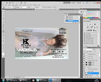 To construct my ancillary texts I had to use Photoshop Cs5. I took screen shots from my video and uploaded them to the photo editing software. I used a digital template I found on line to build my own over. Slowly I built up the covers editing the images to intensify the reds and lighten and darken areas to continue my colour scheme from my video to my ancillaries. I then used the Internet to source different style fonts that would suit the style of my product, editing them in publisher and transferring them to Photoshop. This allowed me try multiple text styles to develop the overall outcome. I used the same techniques when producing my magazine advertisement and use knowledge from my As Media foundation portfolio. Last year I learnt these particular skills on Photoshop and this year I have used the same skills and developed them further learning new and more difficult ways of producing my media texts. I used my knowledge of music magazines and remembered the conventions to follow when creating my magazine advertisement. I could see that I had come along way, in terms of editing skills, from last year as I was producing an advert what would take me months last year in just a few days.
 When I was happy with the overall outcome of my final draft of my music video I uploaded it to YouTube using tags so that my video would come up in as many related subject searches as I could. I then used social networking sites such as Facebook and Twitter to share and create interest in it and to promote the media production. I tweeted my video using hash tags such as #musicvideo and #beyonce to accumulate as many views as possible. I then posted my video onto people walls on Facebook and to the news feed. I also got the dancers to do the same so that I wasn't just sharing it with my group of on line friends but 7 other groups too. This potentially reaching up to 16,000 people and if they shared with their friend then the amount becomes infinite. In less than 24hours my video received 1,000 hits with 19 people in America watching, even people from places such as Taiwan and Egypt. The power of these platforms helped distribute and promote my video to a wide ranged audience in such a short space of time.
As the editing suite is in such a communal area plenty of people gave me pre-production audience feedback whilst producing my video. The people where a part of my target age group and perfect for giving me some productive feedback.
As the editing suite is in such a communal area plenty of people gave me pre-production audience feedback whilst producing my video. The people where a part of my target age group and perfect for giving me some productive feedback.
I conducted a questionnaire to achieve some valuable audience feedback for my selection of products. I targeted people within my main age range of 16-19. Firstly I asked whether they could correctly identify my genre of Pop/R&B/Electro House. 100% of the people I asked said “Yes”. 70% of my responsive audience where female with 60% being 17, the rest 18 years of age. This response showed me that I had correctly stuck to the conventions of my genre to produce a well identifiable Pop/R&B music video. I am now also aware that my video is easily recognisable for my chosen target group.
I then asked, “How well do my ancillary texts work with my music video as a whole product?” 100% positively replied saying that the products worked well together in a continuous way with 50% specifically mentioning the obvious red, black and white colour scheme throughout the products. A further 30% recognised imagery from the music video and said that the images clearly represented the idea of female empowerment throughout. These responses reinforce how well my products work well together as a whole and I have achieved my goal of producing a product that is easily identifiable. My use of colour scheme and choice of imagery has also worked well as my target audience have been able to identify the links between products including text, colour and imagery.
My third question to my target audience was, “Does my digipak relate well to the content of my video?” Again, 100% answered ‘Yes’ with 40% of answers including some relation to the obvious genre representation in both products and how they are clearly linked through the stylisation of each genre. The rest commented upon the continuity in imagery, colour scheme and text style. These responses, especially that 100% have positively responded, shows me I have achieved a well-rounded group of products that share conventions to create continuity between them. It also shows me that the public will be able to relate the products and identify them on the shelve or virtually on iTunes.
I then asked my responsive audience if my magazine advertisement would interest them to buy my album on iTunes or from a music shop. 90% answered ‘Yes’ with 20% saying that the positive female representation inclines them to purchase the album. 30% of people commented on the reliable high ‘star rating’ saying that a high rating would influence them into buying the album. The 10% who said they wouldn’t purchase the album said it’s because they are not particularly interested in the pop/R&B genre it belongs to and would opt for a less mainstream genre when purchasing music. This shows me that my magazine fulfils its persuasive intention to its full potential by encouraged a large amount of my target audience to buy the album.
When I asked my audience “does my music video targets their particular age group?” 100% responded ‘Yes’ again mentioning how the video is contemporary and up to date which is very important within the psycographics of my target audience as they like to stay ‘in the know’ on what’s current. A male of 17 said the video is appealing to him due to the sexy women portrayed in it and again referred to the video as ‘modern’. A female aged 17 also said, “The video very much meets my needs and interests.” This feedback tells me I am on track with targeting the 13-19 year olds and that I am keeping up to date with current trends in fashion and music that appeals to the young audience.
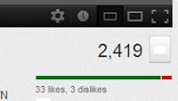 After posting my video on YouTube account users where posting comments about my video such as, “pretty sick” and currently has 33 likes and 3 dislikes out of 2,419 viewers. This positive feedback showed me I was targeting the right audience and that my audience was enjoying my media construct. I also posted my videos to social networking sites such as Twitter and Facebook where people where liking and commenting on my video, this really gave me an insight into the audience’s views on my product and whether my video interested them, which it did.
The demographics form my YouTube views break down the viewers into age group, location and gender. The graph shows me that I have successfully target my intended target audience with there being 67.4% female viewers and the rest males, I predicted there would be a 70/30 split. The graph also shows me that the main age group interested in my video and who have watched it is 13-17 year olds my aim was 16-19 so this information shows me I am targeting the correct audience for my video. It also shows me that my video targets the interests of this audience for them to want to watch it.
The demographics form my YouTube views break down the viewers into age group, location and gender. The graph shows me that I have successfully target my intended target audience with there being 67.4% female viewers and the rest males, I predicted there would be a 70/30 split. The graph also shows me that the main age group interested in my video and who have watched it is 13-17 year olds my aim was 16-19 so this information shows me I am targeting the correct audience for my video. It also shows me that my video targets the interests of this audience for them to want to watch it.
Total Word Count: 5,695
.jpg)
.jpg)

.jpg)


