- Necklace (used as tiara) PRIMARK.................................................................£3.00
- Earrings PRIMARK.................................................................£2.00
- Bangles (x2) PRIMARK.................................................................£5.00
- Black Netted Dress DOVE HOUSE........................................................£8.50
- U.S.A Flag EBAY........................................................................£3.00
- Fake Blood JOKE SHOP.............................................................£1.50
- Cape JOKE SHOP.............................................................£12
- Tattoo Sleeves (x2) RIVER ISLAND........................................................£5
- Chain Sunglasses BEASLEY'S..............................................................£6
- Fake Eyelashes (x7) HOME BARGAINS..................................................£7.00
Thursday 29 March 2012
EXPENDATURE


MAGAZINE ADVERTISEMENT IN THE OUTSIDE WORLD

I have photo shopped my magazine advert onto a billboard to test the conventional look of the ad. I think i have achieve a well rounded advertisement which appears professional and complies with traditional conventions of advertisements.


MAGAZINE ADVERTISEMENT RESEARCH

Reviews and ratings are then placed underneath this text from magzines. They have also included a quotation. This advertises the album to the target audience who read these magazne as they are likely to go out and by it if the magazine they read likes it. They have placed the record label at the bottom of this article also advertising the label. The warm glow of the text contrasts wuith the harsh black with then continues at the bottom half of the page when the texts turns white on the harsh black background. All these elements provide an aesthetically pleasing advertisement and one that holds continuity in both text style and colour choice.
The style of writing is very Art Deco/ Broadway type font. The writing combined with the dramatic imagery provide an operatic style advertisement which is appropriate for the Indie-pop ballet genre of music. Her face appeared obviously airbrush to produce a fantasy styled image and the glow of the lights are reflected in her eyes, create furthur continuity.
The use of a central placed font keeps the text organised and structured listed in order of most important for the audience to read, naturally our eyes start from the top. The use of the medium close-up and prominant placing of the eyes placed we are immediately drawn to the top of the advertisement. This helps lead the audience in the appropriate places of the advertisement.
The fact she is looking away from the audience makes her appear vulnerable. It makes the audience feel sorry for her and helps to convey emotion form the music through to the advertisemnet. The obvious glowing gold colour scheme create coninuity in the advertisement and help connote the title of the album "lights"


MY RECORD LABEL


RESEARCH

I created the name HEX RECORDS as the meaning of HEX is to bring bad luck or put a curse on someone. With the hidden Satanic symbols in the video and the meaning, which is girls being powerful and taking over I thought this track would match well with the name of this record label.
I checked on line to see if the name was available and then searched for fonts on line. I tried out a few different designs in the left hand column. I tried to stay conventional from the research I previously found using black and white and creating a geometrical overall shape. The fonts I chose reflect that of the meaning incorporating signifiers in the font.
FINAL RECORD LABEL DESIGN

IDEAS FOR TRACK NAME (DIGIPACK BACK COVER)
I wanted the album to continue the themes of power and control throughout so I have chosen tracks names that relate to these elements. I wanted a range of length so that they spike over parts of the back cover image to create an interesting layer. The text style will be continued to the back cover to create continuity, i am also considering keeping the same colour to further continue the style. The connotations of the track names link with the title of the song I have produced a video for.


The negative space in the centre provides a square shape perfect for exposing the underneath layer of the image.
FONTS (FRONT COVER DIGIPAK)


I have gone for a techno style font with harsh diagonals. I wanted to achieve quite a powerful look with the title to fit the song and impact the audience. The text, to me, feels very violent and aggressive. It also has a slight futuristic effect with the breaks in the lettering which could be related to that of a time bomb. This links in with the stylisation of the video with the regimental and army style costume in the final section of my video.
FINAL IMAGE CHOICE

Iside Left

CD1

CD2
Front Cover

Back Cover

Outside Right
These are the final selection of images I have chosen for my digipak.
IMAGES FOR MY DIGIPAK


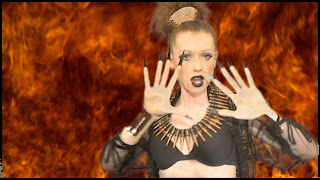


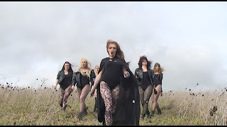
These are stills from my footage which portray interesting composition, colour and action. Some show the lead predominantly in the image providing a great photo for the front cover, like the one above. Other images, such as the saluting images, show the content and meaning of the song which is great from the inside of the digipak, so that the audience understand the point of the video.
Subscribe to:
Posts (Atom)